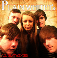
Throughout the products I have created I have consistently used the same font which was called "Poor Richard" and the same colour scheme across all of my products that I have produced throughout this project. When researching real media products in the beginning stage of this project, it was a clear convention that every band have their own band identity, such as a certain symbol or design with in the media texts that the fans would identify easily, and would relate back to this specific band. However this wasn't something that I wanted to do with my products so instead i applied the consistence of a rustic, brown background, and the "Plain White T's" would always be in white, with the "P, W and T" always being in a bigger font size than the rest of the letters. Above and below the "Plain White T's" would constantly be a bold, clear red line, this was to make the words stand out more to the audience. This allows all my products to be easily identified and linked back to the band. A symbol that would also link all of my products together was the red petals, within each product petals would be falling down the page, this has been placed in my digi-pack and magazine advertisement, the logo although a heart is made out of the same rose petals that fall down the page.
Looking through the Plain White T's album cover and poster advertisements, the band use the same font for the name of their band in the same colour every time Although this is a small convention the fans will notice this and link the font and colour back to the band.
.jpg)
When creating the music video we came across a convention that was very popular split screen and band shots in black and white and the narrative of the story in colour.
This such a common convention as it helps to move the narrative along and show the audience two side of the video, with the band shots if they are in black ad white in isolated areas then the audience will understand that the band members feel alone, upset sad, whereas if they were in colour the audience would think that the band members are happy and cheerful. Changing a small detail such as having colour or black and white can change the whole meaning of the video.
The use of consistency has been identified through the album work using the same font and colour throughout every advertisement for the band. The dull colours used in the "Hey There Delilah" music video has also been used on their album this shows then band that the two products are linked.

In further research for my magazine advertisement i noticed that social networking sites logos are now always place on the products. The presences of social networking sites among the young teenager generation is highly prominent, therefore I felt it was necessary to place the Facebook and Twitter symbols at the bottom of my magazine advertisement as it is a common convention now seen on real media texts, for an my target audience.
Throughout my work I have followed the conventions of using motifs within my media products which i noticed was prominent in the work of the official Plain White T's work. A motif is a dominant theme which recurs throughout the specific text. I have show already in the images above that the Plain White T's uses the exact same font, in the colour white, the letters are always in capitals. I have used a motif with my ancillary products, using petals which look like they are falling down the page, this is to add a distinguished and creative design for my young teenage audience. I have used the motif in my magazine advertisement to captivate my teenage audience as well as using it in the digi - pack which feature falling petals on every other page of the booklet.
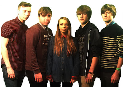
In my ancillary products, I have applied elements of gaze theory through my the photography that I have taken. Through the use of the gaze theory, it enables a wider audience to identify with the product through the visual attractiveness of the band. In the band there are four male members and one female, therefore this will attract both male and female audiences. The five band members together are visually attractive in which people are drawn to. Having both genders in the band opens the audience up wider as the female audience will find the male band member attractive and will aspire to be like the female band member where as the male audience will aspire to be like the male band members and will want to be with the female band member as they find her attractive.
I have applied this theory subtly, as through the genre of Indie/rock it would subvert conventions by being overly sexual in their appearance. This can bee seen through the outfits the band members are wearing, the male band members wearing either a shirt hanging over their jeans which would be of a dark colour, or wearing a jumper over the shirt with a design on the jumper, the male band members would look casually smart in their Indie/rock genre. Where as the female band member would have long hair which would be down, wear a shirt with skin tight leggings, subtly showing her physique in a way that is conventional to the Indie/rock genre. Therefore, by subtly using gaze theory it conforms to the conventions of the Indie/rock genre.
Through research traditionally Indie/rock band always feature only one female band member with up to three to five male members, the female band member will traditionally always be the vocalist along with possibly a male vocalist. I believe that through following the conventions of the band line up commonly seen within Indie/rock genre, it made the mise-en-scene of the music video more genre specific.

Band cast
Music Video
Our video follows the conventions of the genre as the narrative follows the normal forms within the genre. This is because it shows the sadness of a relationship and the emotions through obscure shots. There is also shots of happiness and past times, however within our music video it shows the common codes and conventions that come from other professional music videos, such as holding hands at a lake or going over a bridge.
.JPG) This shot is a common convention as the shot shows the two together holding hands, close together, this gives off a happy vibe.
This shot is a common convention as the shot shows the two together holding hands, close together, this gives off a happy vibe. This shot is from Ben Howard "Only Love " this shows him in a blacked out background, close up of him singing and playing the guitar. We have a shot of our guitarist playing by himself in a blacked out background,however we decided to keep him in colour as we thought it would stand out to the audience clearer.
This idea came from the band we were researching about the Plain White T's, the song "Hey There Delilah", they were aerial shots of New York at night, so you can see how lively the city is at night, we decided to get an aerial shot of London to see if we could get the same effect.
A shot that is becoming more conventionally common is showing a text from a loved one, either showing the audience what the person said or show that the message has been deleted. Showing the audience that the couple is either making up or breaking up. This is an image from the song "7 things" by Miley Cyrus


.JPG)
.JPG)
.JPG)
.JPG)

.JPG)
.JPG)
No comments:
Post a Comment