Although I have completed my sketches for my album cover, I have decided to complete some more research to make sure I get all the common conventions, and possible styles right.
The front of the CD cover is very simple and plain, however from these images I do get a jungle/gorilla feel from the character that have been designed.
The title of the album and the band are in a simple font, in a plain colour white, it works though as it contrasts well off the blue background.
As I have said before the characters that have been designed have got that gorilla sense about then if you look at the noses and jaws, this is ironic as the band is called the "Gorillaz"
From looking at the characters you can see that they are all a different colour purposely,this is to show the audience that everyone is equal to each other, each member has the exact same space in on the CD cover. This shows that they are all equal to each other even though they have different features.
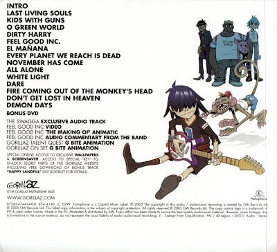
Here you are able to see the full length of the characters, seeing how they are individuality, from this image I can see that the guitarist is the main member in the band as he is at the front of eh CD cover, his character has also been drawn bigger than the rest of the characters and is also more noticeable.
You can see the Gorillaz logo near the bottom of the CD cover on the left hand side, below the logo is also links to there websites, Facebook and more, as well as the record company and distribution company.
The background is plain white therefore any colour will contrast off of the background. The font of all the songs is the same as the font on the front of the CD cover just a different colour.
This album CD cover is a simple design as well, an extreme close up of the artists face, when facing away from the camera.
Having lights behind the artist light up the whole image so it doesn't look as dull, the lights behind the artist relate to the name of the album which is called "Lights". Some of the lights have been placed in the artist hair, in my opinion this is to slightly boarder the artist face so we look straight at her face then down to the title.
The title of the album and the name of the artist have the same font and colour, however the artist name is much bigger, as that is what the needs to catch the audience attention first then know what he album is called afterwards.
Here a plain simple back cover, simply a black background, with the songs on the album going down the middle, in the same font and colour as the title on the front cover.
The only information on the back cover is the distribution company, record company etc. The font for the rest of the information is in the same font but the colour is white to show that there are two different information parts on this CD back cover.
Clear white background, you are unable to see the band members faces, all the band members are facing away from the camera, there body have also be basically blacked out so you just see the outline of their figures. Your also unable to see anything in the distance its just white mist, this to me says that the album is going to be very mysterious.
The title of the band is in a clear, bold, thick font clearly standing out from the background, just above is the name of the album, the font is the same except it is of a smaller font, all of the letters have been made skinnier but still stands out clearly to the audience.
This is the back cover the main image has the same feature as the front image with the band members bodies being blacked out. Again looking out to the sea shows to me mystery with in the album. The title of each song has the same font as the front cover title for the album.
Both the images on the front and back of the CD cover show real mystery in the album as the band member characters are always looking away from the camera so we are unable to see any emotion in their faces.
From this album annotation I now know that I don't have to use the band member or artist as my main image I can use a drawn character or symbol that represents the band or artist. I also now know that if the main image is of the band members or artist I don't have to have them facing the camera, I can have them looking away as it is just effective.
If I want text I should keep the same font for all text, possibly slightly changing it by making the letters thicker or skinnier etc.
Important information such as the record company, links for websites etc always goes down the bottom of the CD cover along with any other logos and the bar code.


.jpg)
No comments:
Post a Comment