With my ancillary tasks I wanted to keep a consistency as well as my main text, making them work together in their own brand identity for the band. As well as keeping consistency within all of my products, we needed to make sure that all of our products as a group maintained a consistency, this is why we all created and agreed on a style guide to work from, therefore if someone place all of our work out they would be able to see that all the product were for the same band. I created a magazine advertisement advertising the release date of the bands new album, however also advertising tour dates, and a digi-pack. The main issues that I had to consider whilst in the production of my ancillary texts was the use of the same logo throughout all the products and the continuation of colours, symbols and image styles.
In my ancillary products, I chose a colour scheme that contrasted well together making texts and images stand out clearly. The background of the ancillary tasks is a warm, bold colour, like the colours in our music video, when the two characters are together in the video the colours are bright, warm colours showing the audience that the two characters are happy together. Although in the ancillary task I feel that the background colour is warm, when the rest of the common conventions have been placed on my products my work has an edgy, rock side to it, incorporating darker colours into the work. I edited the main images I used on my ancillary tasks to fit the genre of Indie/rock, but adjusting the brightness and contrast of the photographs I edited the photographs to make them darker and give them a slightly darker shadow.
Edited version.
You are able to see that the edited version has more of an edgy, dark, Indie/rock to it.
For the photography of the ancillary text, we used a variety of locations, we used Bluewater lake which was a romantic location, we also used London Bridge train station, once edited this was a great location for the lonely, sad part of the music video, which suited the genre of the music video perfectly which then created a strong sense of mise-en-scene for the Indie/rock genre.

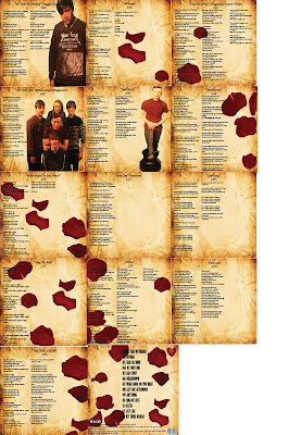
In my opinion my two separate ancillary tasks that I created worked well together to create a strong brand image for the band; The Plain White T's. The continuation of styles such as the falling petal and type of editing I placed especially on the photographs proved to make the entire product look more like it belonged to the genre of Indie/rock, it was also an attractive feature for the target audience that we were wanting to attract.

Here I have placed a poster with petals and without petals, you can see the petals stand out well to the audience and add a real effect to the entire advertisement. As having a symbol to represent the band is a common conventions a genre for Indie/rock.
I also placed the falling roses on the back of my album cover and on every other page inside my albums booklet.
Both individual text incorporate motifs separately yet work well together in unison, the main theme with in the main text is within the narrative of the music video, when the two characters are together and happy the video is in colour, however when the two characters are apart the video is in black and white, whereas the main motif in my ancillary task is the falling rose petals.
The combination of these two motifs across two different media platforms work we, as when the two characters are apart in the music video the video is in black and white and the rose petals fall down on my magazine advertisement however in the music video when the two characters are together the video is in colour and there is a full blossoming rose that has been placed on the from of the CD, proving a synergistic relationship.


.JPG)


No comments:
Post a Comment